9 Tips for Optimizing Business Intelligence Dashboards
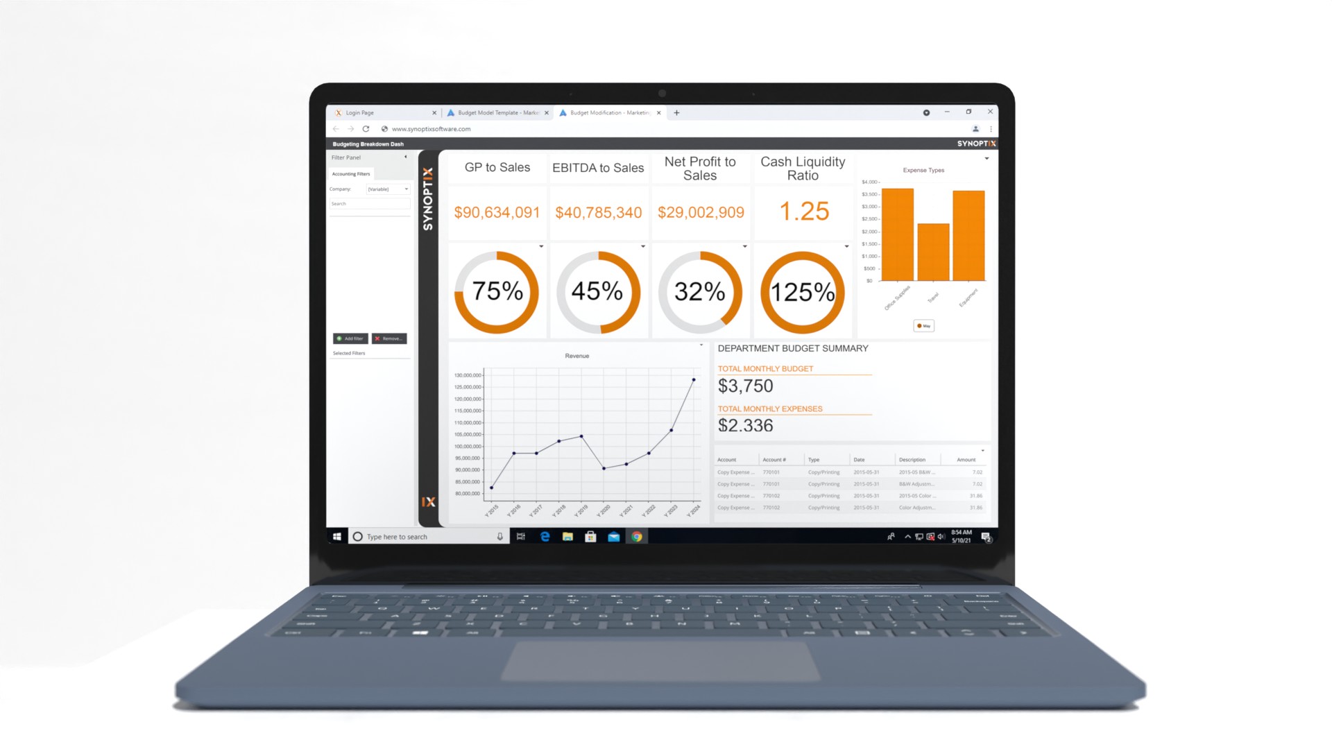
These days, businesses of every shape and size utilize business intelligence dashboards to collect and analyze their important data. But just because you’ve installed business intelligence dashboards to track KPI’s and other metrics, doesn’t mean they can’t be doing more for you. As one of today’s leading experts in financial reporting software and business intelligence dashboard creation, Synoptix offers some insight into how to streamline your dashboards and all of the industry best practices in use today.

Here are 9 tips for optimizing and improving your business intelligence dashboards:
1. Clearly Identify Your Dashboard Requirements
Before diving too deeply into the details, it’s important you have a concise idea of how you want your business intelligence dashboards and reporting tool to work for you. Of course, simply using your dashboard to collect statistics to turn into departmental reports is simple enough. But what type of data do your specific departments need? It’s no surprise that your sales teams’ needs will differ drastically from your finance department, so identify what these are from day one.
2. Choose the Business Intelligence Dashboard that Most Meets Your Needs
After considering and assessing what your goals and expectations are, go with a dashboard that can easily help you get the important insights you need most. There are a number of dashboard types you’ll need to assess that will act as the tool you’ll use to collect your most important data, such as:
- Tactical Dashboards: This particular type of dashboard is most commonly used by those looking to get an in-depth review of a company’s processes on a weekly or monthly basis, to demonstrate trends. This is the preferred dashboard for mid-level managers.
- Strategic Dashboards: This is the type of dashboard that will provide your organization with vital data about your company’s status and campaigns, in addition to highlighting areas upon where you can improve.
- Analytical Dashboards: With this, you’ll be able to demonstrate data across predetermined timetables and other variables to demonstrate the success of your campaigns.
- Operational Dashboards: For those who want to focus on real-time changes and issues that arise, or keep a close eye on Key Performance Indicators (KPI’s), then this is the dashboard for you.
3. Design Your Dashboard to Be User-Friendly
Setting up your business intelligence dashboard to be both user-friendly, as well as minimally distracting, is essential. You want all of that important information right there in front of you, and you don’t want it to be cluttered up with superfluous or unnecessary data. If something isn’t entirely necessary then don’t hesitate to cut that graphic out.
4. Call Attention to Numbers
Some use dashboards for graphs, others to identify long-term trends; but for some, it’s all about the numbers. So, do what you can to make the hard data and numbers stand out by either bolding them or giving them a different color that catches the attention of users. Enlisting a tool that allows you to drill down into those numbers is also important. It’s critical you’re able to see the story behind the balances.
5. Restrict Access to Only Those Who Need It
Since your dashboard’s components, layout, and other features will be so precisely designed, it’s important that only those who are familiar with it have access to it; otherwise, things could go awry pretty quickly. Many of today’s leading business intelligence dashboards come equipped with options so you can manage the roles of who has access to such content.
6. Arrange Your Data Accordingly
Many use dashboards to quickly pull up the most important information they need, and leave the rest for later, kind of like reading the first sentence in a newspaper article; it should, if it was written well, tell you everything you need to know. So, arrange your dashboards and always follow this rule: the most important information should be first!
7. Choose the Best Chart to Represent Your Data
There are a host of different charts and graphs you can utilize to showcase your data, but choosing the best one aligned to your needs is important. You’ll want to be able to easily interpret such data, so consider the best way to do so. Most often, vertical bar graphs are useful for comparing trends side by side; line charts work well for showing trends over longer periods of time. You get the idea!
8. Include the Most Important Info on a Single Screen
This sort of piggybacks off of Tip 6. You should include all of your company’s most important data on a single screen; there should never be a scenario where team members have to search around your dashboard for the data they need. It should be right there in front of them. Remember who will be accessing the dashboard and design things accordingly to make it as easy as possible for them.
9. Always Display Things in the Proper Context
When it comes to closely designing charts and graphs and other things in your dashboard, always keep context in mind. Shapes and colors affect people’s perceptions even before they’ve had a chance to look at the data. For example, including numbers in red font is a no-no, as one immediately jumps to the conclusion that it represents a loss in revenue. There’s a balance that you’ll need to perfect when displaying your data that you’ll learn quickly with the right business intelligence support.
Contact us today for more about how business intelligence dashboards can help you!If you want to improve processes, investing in the right business intelligence dashboard is an absolute must. The team from Synoptix would love to walk you through the process, so visit us online today or call 801-254-4503 for more information. We also specialize in budgeting solutions, financial reporting services, and more!


